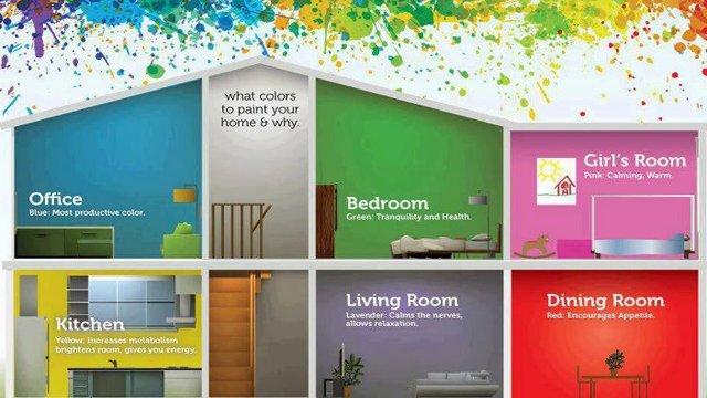
Application of Colors in Architecture
Application of Colors in Architecture
Color scheme should be based upon the certain concept and concept depends upon the nature of space. So, concepts changes for formal space or informal space; whether you want to have fresh effect or aged effect; whether you want to have organized discipline or controlled chaos.
The first considerations are the orientation of the room, existing finishes, furniture and the artifacts to be placed in room.
In the absence of these, the importance should be given to unique things which are difficult to obtain such as piece of art, marble for flooring, antique carpet because the variety of fabrics and paints is available in market in plenty. So, the reverse order shall be more difficult to accomplish.
For planning a color scheme, we must consider three main components of shell –
- Walls, floors, ceiling
- Proportions of the room
- Balance of solids and voids
1. Walls, floors, ceiling
People feel more comfortable in room with light ceiling, medium walls and dark floors and it corresponds to the color of sky, foliage and earth respectively.
2. Proportions of the room
If a room is too large, the effect can be subdued by using dark colors and complementary color schemes. If the room is too small, it can be made to appear larger by the use of light colors and monochromatic and analogous color schemes.
3. Balance of solids and voids
It determines the amount of light entering into a room. If a room lighted more than the desired comfort level, then the effect can be subdued by use of dark colors. If amount of light entering into the room is lesser than the desired level then the effect can be subdued by use of light colors. It depends on the extent of windows in a room.
Proportions of each color in a color scheme are also important. You have to balance entire design scheme by use of light and dark colors. You have to identify the objects which are to be painted with light color or dark color. So, smaller objects should be in dark colors.
Choice of color scheme also depends upon the nature of projects. For residential areas, harmonious color schemes (monochromatic or analogous) are preferred and preferably cool colors are used on southern sides and little bit of warm colors are used on northern side (Indian context).
For Health Centers, soothing colors are used with a little bit of warmth such as combination of off-whites and browns.
For Hotels and Restaurants bright and warm colors are used with complimentary color schemes. These colors are used to provide stimulating and exciting effects. Examples: red, yellow, orange with complimentary colors.
For Nursery Schools, bright colors like red and yellow with complimentary color schemes are used which depicts childhood.
- Red depicts childhood
- Yellow depicts youth
- Green depicts maturity
- Blue depicts old age
Colors are also important for Exterior Façade. Color concept for exterior façade depends upon the whether building should merge with surrounding or it should be isolated with the surrounding.
When building is to merge with surroundings, colors used are greens, light browns, blues which are close to nature.
For building which should be isolated from surrounding red, magenta colors are used.
Larger areas on facade should be painted with light colors with small horizontal bands painted in dark colors.

