Project of an (A)symmetric City – Architecture Student Work
(A)symmetric City or PROJEKT MIASTA (A)SYMETRYCZNEGO
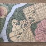
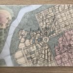
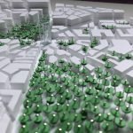
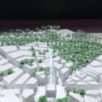
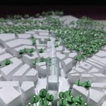
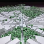
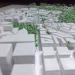
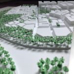
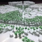
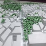
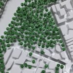
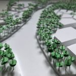
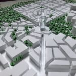
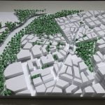
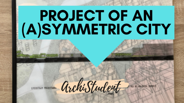
The project shows the concept of an (a)symmetric city. It is in 1:2000 on A3 size and includes a plan based on a compositional grid, section, axonometric projection, a hypsometric map, and a mock-up. The urban complex is divided into two parts – one part on the west in regard to the river and another one to the east. The western part is peaceful and sparsely paved over, while the eastern portion has a high-density development. There’s a park near the river – a place meant to chill and to integrate residents. The main part (on the east) has four axes and a dominant in their intersection.
Check out the pictures to get the amazing idea of coming up with this kind of project:
It’s based on the shapes of an octagon and a square. The transparent tower is the heart of the city – you can see it from any point, because the roads meet in a square, where it stands, and it’s the highest building. It also looks different from distinct sides. The roads lead to the roundabout under the square. One of the roads is on the axis which connects the tower with a hill beyond the river. There’s a small church at the top of the hill – also seen from any point of the city, thanks to the downland. There are a few detached houses too and a lot of greenery everywhere. The eastern side has some characteristic regions and you can see three main heights when you look at the skyline – it raises unto the east. There are some factories, many tenement houses, a housing estate and some office buildings and skyscrapers. The structure of the spatial complex is varied, but consistent thanks to the axes and the dominant. You can take a look at the end of the city from another end and see how the skyline changes.
Design by : Aleksandra Metzler


