

Every architectural drawing tells a story. Before a space is built, before materials are selected, and before a structure becomes reality, it exists through lines on paper or screen. But not all lines are equal.
In architecture, line weights are one of the most powerful visual communication tools. They define depth, hierarchy, materiality, and spatial relationships. A well-crafted drawing with proper line hierarchy instantly feels professional, readable, and immersive. On the other hand, poorly managed line weights can make even the best design appear flat and confusing.
Whether you are an architecture student, interior designer, draftsman, or professional architect, understanding line weights is essential for creating high-quality plans, sections, elevations, and presentation drawings.
In this guide, we’ll break down the importance of line weights in architectural representation, how they affect perception, and the best techniques to improve your drawings.
What Are Line Weights in Architecture?
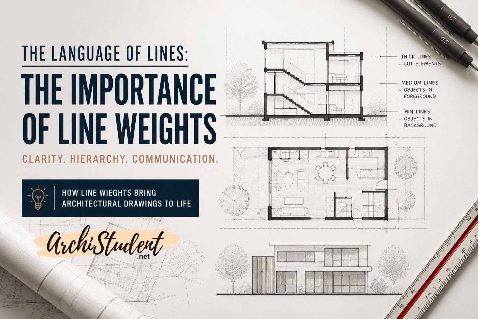
Line weight refers to the thickness or darkness of a line used in architectural drawings. Different line weights help distinguish elements based on their importance, distance, visibility, or material properties.
Architectural drawings rely on visual hierarchy. Instead of explaining every element with text, architects use line thickness to guide the viewer’s eye naturally.
For example:
- Thick lines typically represent elements cut through in sections.
- Medium lines often define visible edges.
- Thin lines indicate secondary information, textures, or background elements.
This hierarchy creates clarity and improves readability.
Why Line Weights Matter in Architectural Drawings
1. Line Weights Create Visual Hierarchy
Visual hierarchy is one of the core principles of architectural drafting. Without hierarchy, all elements compete for attention equally.
Proper line weights help viewers instantly understand:
- Which elements are closest
- Which objects are structural
- Which details are secondary
- Which spaces are important
A drawing with strong hierarchy feels organized and professional.
Example:
In a building section, the cut wall should appear much darker than furniture or background details. This instantly communicates the sectional depth.
2. Line Weights Add Depth and Spatial Clarity
One of the biggest challenges in 2D representation is communicating three-dimensional space. Line weights bridge this gap. The closer an object is, the darker and heavier its line should appear. Objects farther away become lighter and thinner.
This technique creates:
- Foreground emphasis
- Midground readability
- Background subtlety
The result is a more realistic and visually engaging drawing.
3. They Improve Drawing Readability
Architectural drawings often contain large amounts of technical information. Without controlled line weights, drawings can quickly become cluttered.
Clear hierarchy allows viewers to read information efficiently.
Good line management helps:
- Contractors understand construction details
- Clients interpret spaces more easily
- Professors evaluate drawings faster
- Presentation boards look more polished
In professional practice, readability directly impacts communication accuracy.
The Three Fundamental Roles of Line Weight
Depth Perception
Line weights simulate spatial depth in architectural drawings.
Darker lines pull elements forward, while lighter lines push them back.
This creates visual layering and enhances realism.
Visual Hierarchy
Hierarchy guides the viewer’s attention through the drawing. The eye naturally focuses on darker and more dominant elements first. This allows architects to control how information is consumed.
Clarity and Legibility
Architectural drawings must communicate efficiently.
Proper line weight usage eliminates visual confusion and makes complex drawings easier to understand.
Understanding Foreground, Midground, and Background
One of the most effective ways to use line weights is through spatial layering.
Foreground
Foreground elements should use the darkest and thickest lines. Examples include:
- Section cuts
- Primary walls
- Structural components
- Important edges
These elements establish dominance.
Midground
Midground elements use medium line weights. Examples include:
- Furniture
- Doors and windows
- Secondary objects
- Interior elements
These support the composition without overpowering the drawing.
Background
Background elements should remain subtle. Examples include:
- Trees
- Context buildings
- Texture lines
- Landscape features
Using lighter lines prevents unnecessary visual noise.
Establishing Hierarchy in Sections
Sections are among the most powerful architectural drawings because they reveal spatial relationships and construction depth.
The “cut” principle is critical here. Any element being cut through should receive the heaviest line weight.
Typical Hierarchy in Sections
Heavy Lines
- Structural walls
- Columns
- Slabs
- Foundation elements
Medium Lines
- Visible surfaces
- Railings
- Furniture
- Openings
Light Lines
- Background details
- Context elements
- Texture hatching
This hierarchy makes sections instantly understandable.
Standard Line Weight Thickness in Architecture
While standards may vary by region and office practices, most architectural drawings follow a consistent range.
Common Line Weight Standards
- 0.70 mm – Major cut lines
- 0.50 mm – Primary outlines
- 0.35 mm – Structural elements
- 0.25 mm – Secondary objects
- 0.18 mm – Furniture and details
- 0.13 mm – Textures and hatching
Maintaining consistency across all drawings is essential.
Line Weights in Floor Plans
Floor plans often fail when every element is drawn using the same thickness. This creates the “flat drawing” problem.
How to Avoid Flat Architectural Drawings
Emphasize Cut Elements
Walls and structural components should appear darker.
Reduce Detail Noise
Use lighter lines for furniture and textures.
Differentiate Objects Clearly
Doors, windows, fixtures, and annotations should have distinct visual identities. This creates balance and improves readability.
Line Weights in Elevations
Elevations rely heavily on subtle hierarchy. Since there is no sectional cut, depth must be communicated carefully.
Best Practices for Elevation Drawings
- Use heavier outlines for primary building edges
- Keep window frames thinner
- Reduce background landscape intensity
- Use tonal variation for shadow and depth
Well-crafted elevations feel clean, elegant, and architectural.
Materiality and Texture Through Line Weights
Line weights also communicate material density and texture. For example:
- Concrete often appears darker and heavier
- Glass uses lighter and cleaner lines
- Wood textures rely on controlled fine detailing
- Landscape textures remain soft and subtle
This helps viewers understand material qualities without written descriptions.
Digital Drafting vs Hand Drafting
The principles of line weights apply equally to both hand drawings and digital drafting.
In Hand Drafting
Architects traditionally controlled line thickness through:
- Pen nib sizes
- Pencil pressure
- Technical pens
- Ink layering
In Digital Software
Programs like AutoCAD, Revit, Rhino, and SketchUp allow line weight management through:
- Layer settings
- Plot styles
- Object hierarchy
- Graphic overrides
Even with automation, understanding visual hierarchy remains essential.
Common Mistakes Architecture Students Make
Using Uniform Line Thickness
This is the most common issue. When all lines appear equal, the drawing loses depth and clarity.
Overusing Thick Lines
Too many heavy lines create visual chaos. Hierarchy works only when contrast is balanced.
Ignoring Background Elements
Background details should support the drawing, not dominate it.
Excessive Texture
Over-detailed textures can distract from the architectural composition. Keep textures subtle.
Professional Tips for Better Architectural Drawings
Start with Hierarchy First
Before adding details, define your major cut lines and primary visual elements.
Squint Test Your Drawing
If you squint and still understand the hierarchy, your line weights are working.
Print Your Drawings
Many line weight issues become visible only after printing. Always test print before final submission.
Study Professional Drawings
Analyze architectural sections and plans from renowned firms. Observe how they manage depth and hierarchy.
Why Line Weights Are Essential for Architecture Students
Architecture school places heavy emphasis on representation. Strong line weight control can significantly improve:
- Jury presentations
- Portfolio quality
- Studio submissions
- Technical drafting skills
- Visual storytelling
In many cases, representation quality influences how design ideas are perceived. A simple concept can appear exceptional with strong graphic communication.
The Psychology Behind Architectural Line Weights
Humans naturally perceive darker and bolder objects as closer and more important.
Architectural line hierarchy uses this psychological principle to communicate space intuitively. This is why professional drawings feel easier to understand even without explanation. The drawing itself guides the eye.
Final Thoughts
Line weights are not just technical drafting tools. They are a language. They communicate hierarchy, depth, materiality, and spatial understanding long before a building is constructed.
Mastering line weights can dramatically improve the quality of architectural drawings, presentation boards, and portfolios.
Whether you are sketching by hand or drafting digitally, understanding how to control visual hierarchy will elevate your architectural representation skills.
In architecture, precision is not only about dimensions. It is about communication. And line weights are one of the clearest ways architects communicate ideas.
SEO Keywords Included Naturally in This Article
- Importance of line weights in architecture
- Architectural drawing line weights
- Line weight hierarchy in architecture
- Architectural representation techniques
- How to improve architectural drawings
- Line weights in floor plans and sections
- Architectural drafting standards
- Architecture presentation techniques
- Professional architectural drawing tips
- Architectural graphics and visualization
A great architectural drawing is more than geometry. It is a carefully composed visual narrative. The difference between amateur and professional representation often comes down to how effectively line weights are used. Master the language of lines, and your drawings will not just show architecture. They will communicate it.